

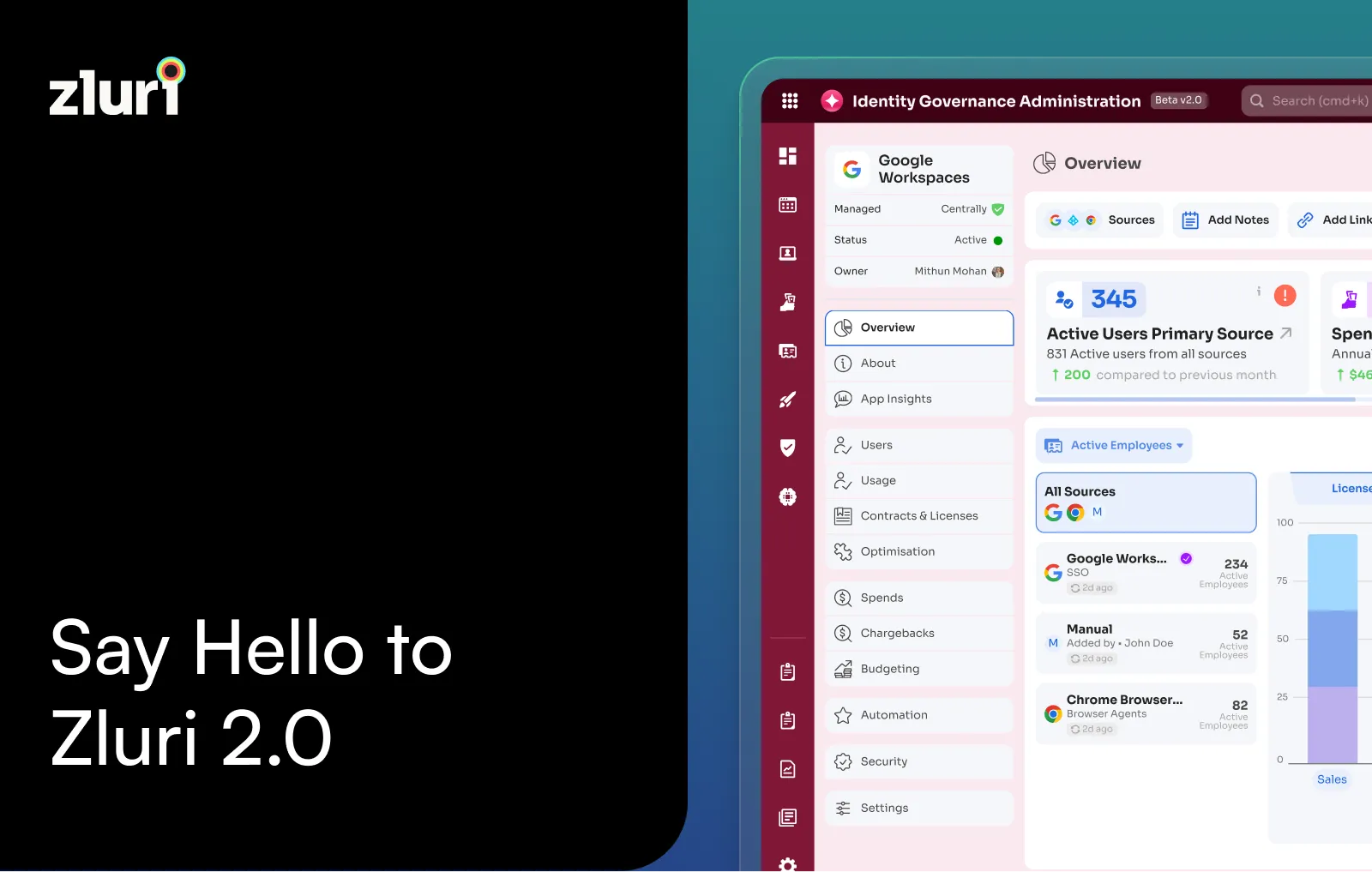


We’re excited to introduce Zluri 2.0, a redesigned platform experience built from the ground up, designed to be faster, smarter, and more intuitive.
Why We Redesigned The Platform
What started as a simple SaaS management tool grew into a comprehensive platform for Identity Governance and Administration covering access visibility, joiner-mover-leaver automation, access requests, access reviews, and license management. As the platform grew from solving one use case to solving many, the user experience had to evolve too.
So we stepped back and asked the core questions:
- How do teams use Zluri day to day?
- What gets in their way?
- What tasks always take longer than they should?
Zluri 2.0 is the result of that process.
We reorganized the platform to match how teams think. We applied consistent design patterns across pages. We surfaced key actions where they matter most, so you don’t have to dig for them. We made filtering and data views more seamless. And we gave every page a familiar structure.
This redesign was driven by a clear goal: to help IT and security teams move faster, think clearer, and act with more control.
What’s new in Zluri 2.0
Smarter Navigation
Zluri 2.0 introduces a split navigation model that separates Identity Governance and SaaS Management into their own workspaces.
Modules like Access Reviews, Access Requests, and Workflows now sit under Identity Governance. SaaS-focused tools like Spend Management, Contract Management, and Optimization are grouped under SaaS Management.
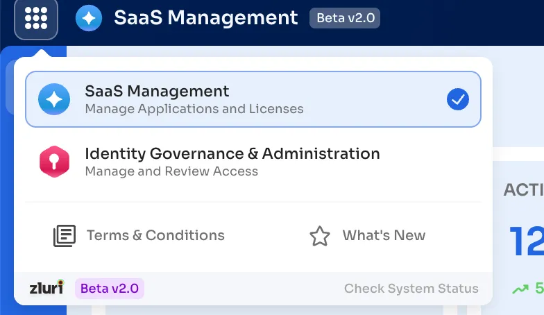
We’ve also moved away from horizontal tabs and adopted a clean, left-aligned secondary navigation. This makes it easier to explore sub-pages, go deeper without getting lost, and stay focused on your current task.
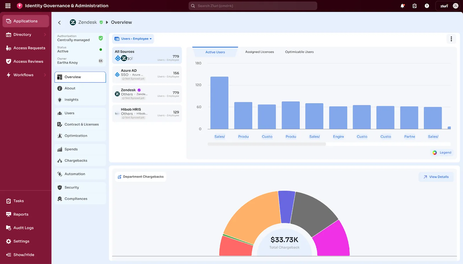
Unified Page Layouts with Insights
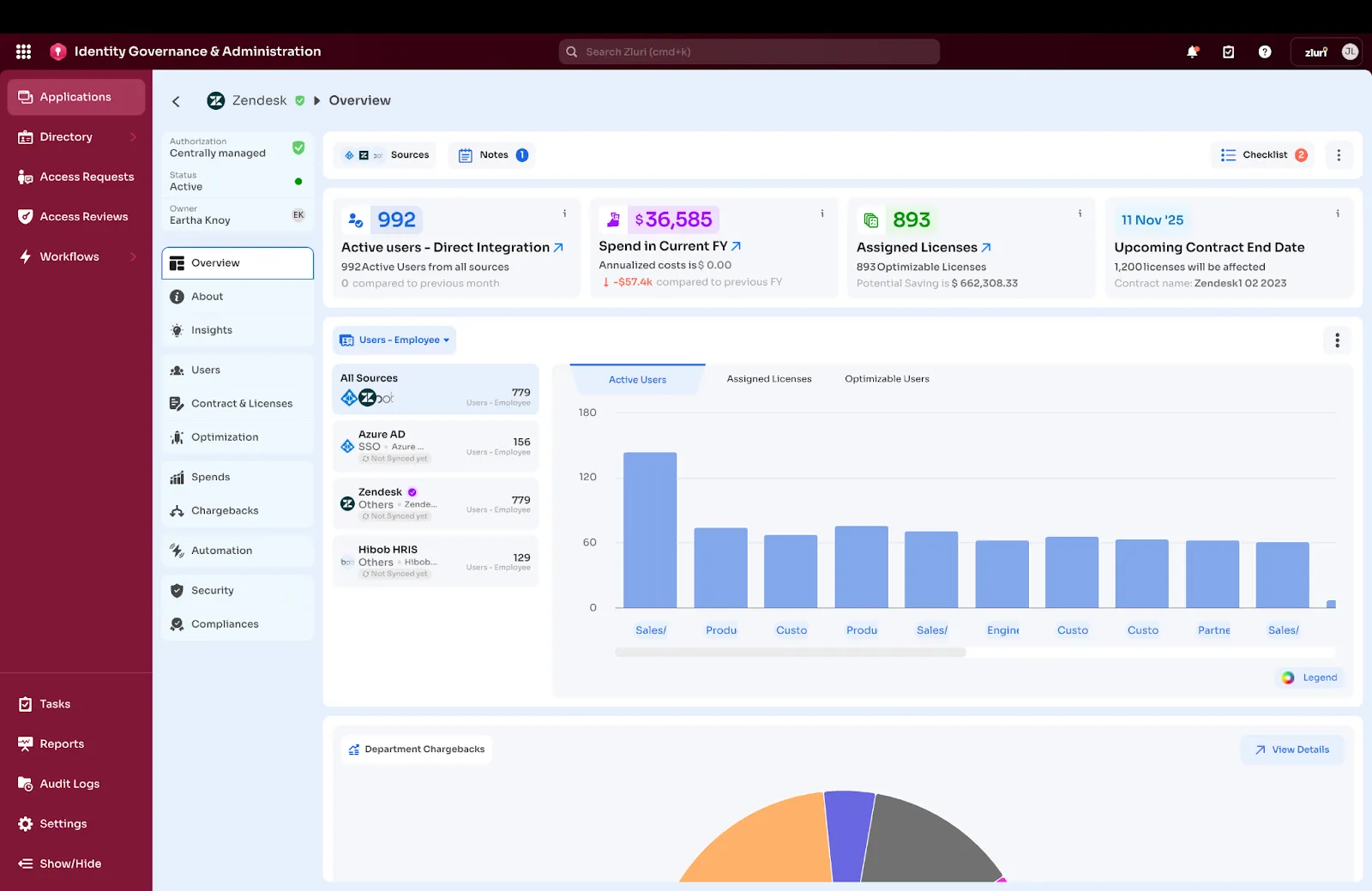
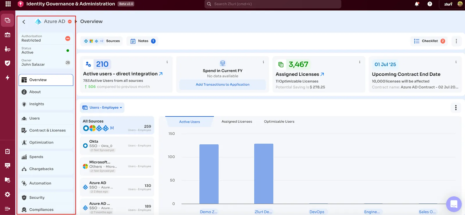
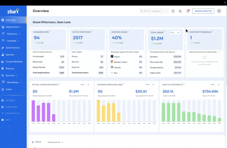
One of the biggest changes in Zluri 2.0 is the introduction of a unified layout structure across all major modules. Whether you’re working in Applications, Contracts, Access, or Spend, every page now follows the same clear pattern:
- Top section: Summary cards showing key metrics (like total apps, spend, or active users)
- Middle section: Visual graphs highlighting trends, breakdowns, or anomalies
- Bottom section: Detailed tables for raw data and direct action
This redesign is grounded in real user behavior across roles like IT Ops, Security, Procurement, and Finance. We found a shared mental model:
“When I land on a page, I want to quickly understand what’s happening, spot anomalies or trends, and then dive deeper only if needed.”
The new layout supports this journey step by step:
- Scan → Understand: Summary metrics and clean visuals at the top give an instant overview—no need to scroll or dig.
- Explore → Discover: Interactive graphs help uncover patterns, outliers, or opportunities (like a spike in app usage or rising costs in a department).
- Act → Validate: When ready, users can move into the detailed table, apply filters, and take action—without losing sight of the bigger picture above.
We’ve also added tools to make this experience more useful: the ability to download charts as CSVs, filter data by source (like Okta or Google Workspace), and break down views by department or user.
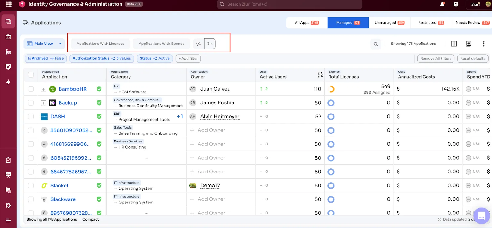
Tables That Work Like Spreadsheets
Most important actions inside Zluri happen through tables, reviewing usage, managing licenses, or tracking spend. So we made tables easier to use, more powerful, and consistent across the platform.
Here’s what’s new:
- Standardized columns, filters, and export options across all tables
- Column-level controls to resize, hide, freeze, and group data
- Search now works alongside filters, rather than overriding them
- You can apply filters directly from column headers, like in spreadsheets
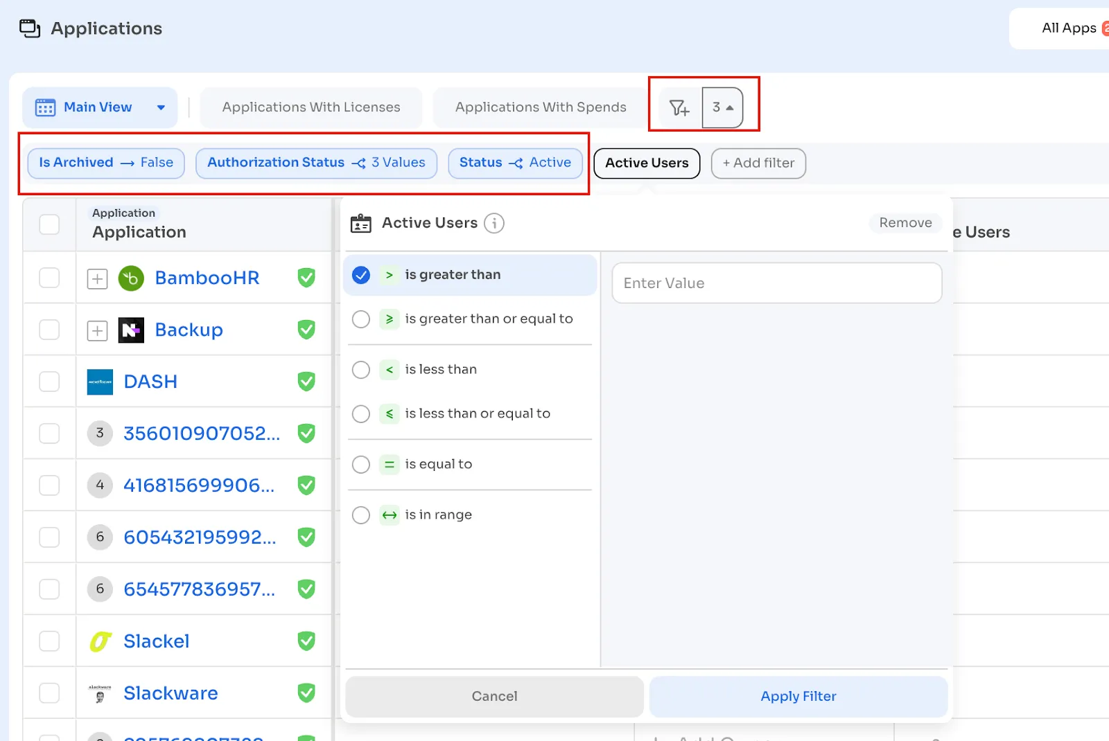
Advanced Data Filters
Filters in Zluri 2.0 are designed to be both simple and powerful. They’re now grouped by data type, making it easier to locate the right filter when you need it. You can search directly within filter menus, and any filters you apply are always visible in a persistent bar at the top of the table, so you can quickly see what’s active and remove or adjust them without hassle.
You can also apply filters directly from table columns, just like you would in a spreadsheet. And with Quick Filters, you can instantly narrow down data with fewer clicks.
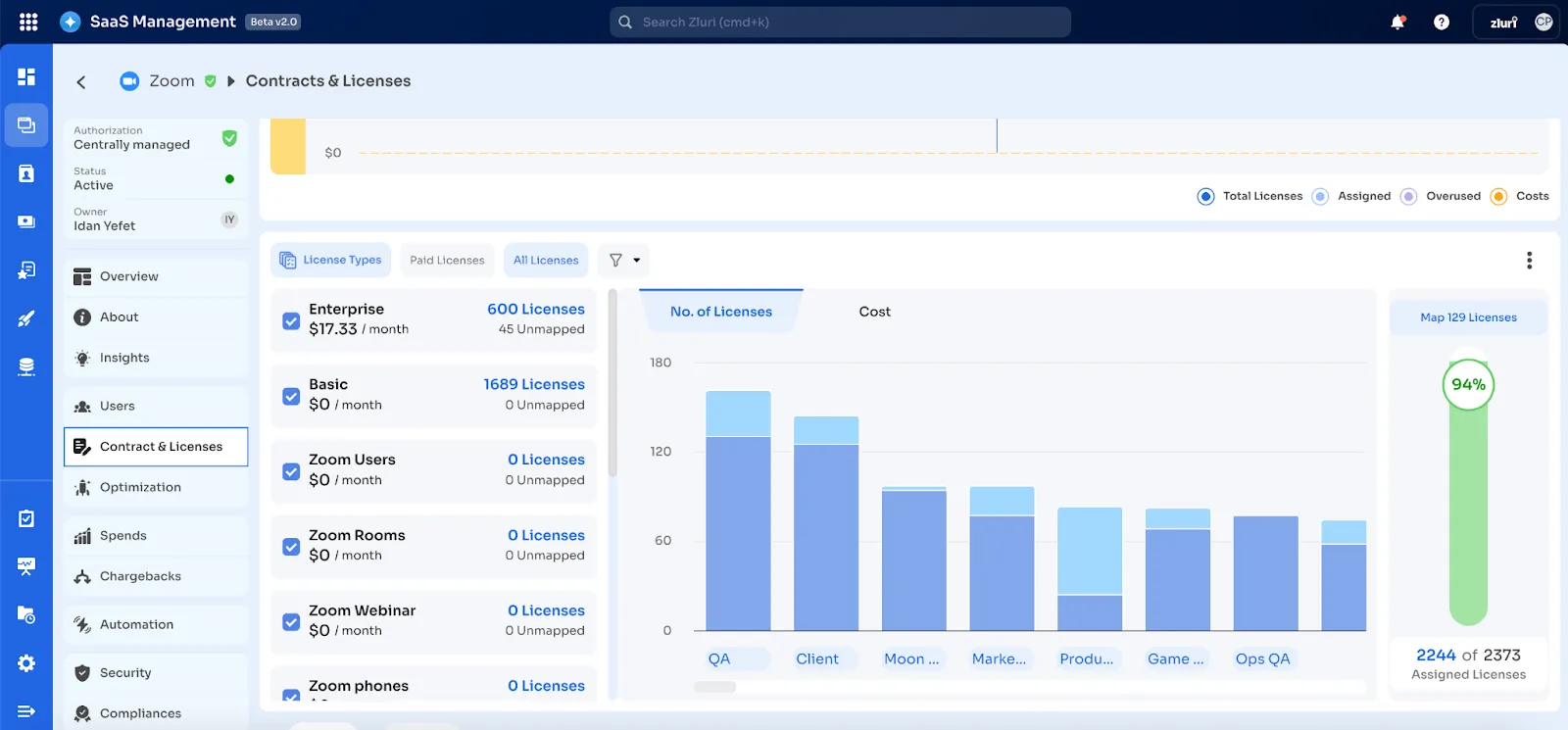
Visualizations That Help You Take Action
Charts in Zluri 2.0 help you spot trends, identify outliers, and understand patterns at a glance. Whether you're tracking which departments are spending the most or seeing how licenses are distributed across roles, the visuals make it easier to decide what to do next.
Here’s what you can do:
- Filter charts by source (like Okta, Zoom, or Google Workspace)
- Break down data by department, role, or application
- Download charts as CSVs for audits, reports, or team reviews
Unified Data Layer
Zluri 2.0 runs on a fully upgraded backend with a unified data layer powering every module. This means that metrics, summaries, and detailed tables all pull from the same source. The consistency builds trust, removes ambiguity, and enables faster, more confident decision-making across teams.
Switching to Zluri 2.0 Is Easy
You’ll see a banner or a toggle next to your profile—click it, and you’ll switch to the new experience. All your data, workflows, and configurations carry over automatically. Once you switch, you’ll stay in the new experience by default.
If needed, you can switch back to the original experience at any time using the same toggle.
Some older UI elements are still being updated. The full rollout will be complete by the end of August 2025.
Zluri 2.0 brings together everything your team needs, simplified navigation, cleaner layouts, rich insights, and data. The platform now fits more naturally into your day-to-day, so you can spend less time navigating and more time getting things done.


.svg)


.webp)


.webp)
.webp)


.webp)